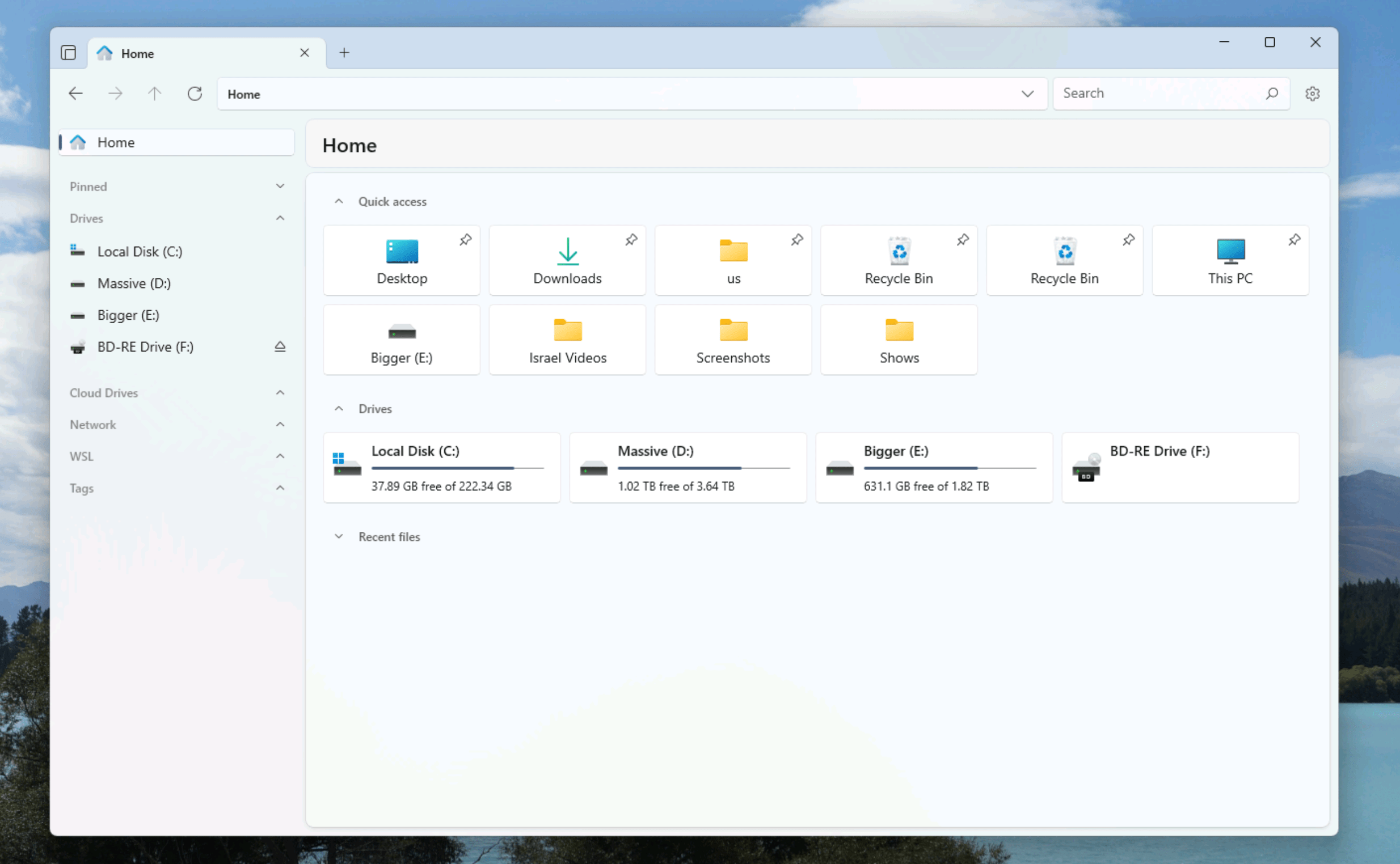
File Explorer is a bit of a mess. The application, which is how Windows users manage their files, has so much clutter that it can be hard to find what I’m looking for. The left sidebar, for example, is auto-populated with suggested folders but never the thing I’m currently looking for. I always end up scrolling past that to get to what I really want: the list of my hard drives. OneDrive is given a place of prominence at all times, even though I don’t really use OneDrive. And let’s not forget the time Microsoft accidently put ads in the File Explorer and didn’t deny that they might show up for real eventually.
I could go on, but I don’t have to, because Files solves this problem for me. This is an open-source application that you can use to replace File Explorer on Windows. It offers a bunch of features that File Explorer does not but also feels less cluttered, which is a hard thing to pull off in software.
An app that respects your choices
To get started head to the download page. The application costs $8.99 from the Microsoft Store or you can install for free using the classic installer, which is linked to at the bottom of the page. The team behind Files asks that you consider donating if you use the free version, which offers all the same features.
Open Files and it initially won’t look that different from File Explorer. The differences come in the way it respects user choices. The sidebar represents this well: You can decide to hide any section you want and that choice will be remembered the next time you open the application. The “Home” page both applications open to by default also represent this well. File Explorer lets you temporarily hide any section only for it to pop right back then next time you open a window. Files, meanwhile, will remember that you hide a particular section. You can even remove a section entirely.
And then there’s cloud integrations. File Explorer heavily prioritizes OneDrive; Files considers it like other cloud services including Dropbox, iCloud, Google Drive, and more. Every cloud service you add is treated as an equal in the sidebar.
And there’s a lot more customization in the settings. You can change what does and doesn’t show up when you right-click a file. You can set your own color scheme, or even set a background image for every folder. Silly, in my opinion, but reflective of the broader philosophy: You should be in control.
Different views
One of my favorite Mac features is the columns view in Finder, which allows you to browse folders in a tree-like structure. Files brings this to Windows and it’s perfect—you can browse your folders using only the arrow keys, or see where you are in context at a glance.

Files also supports all the same views offered by File Explorer, and it’s pretty good about guessing which view you might want based on the folder you’re in. I opened a folder of images, for example, and it showed me large thumbnails. In addition there’s a preview pane that includes details. I found this nicer, if similar, to the preview pane in File Explorer.

There’s one more feature I love: a command palette, which allows you to execute all kinds of commands in just a couple of keystrokes. Just press Ctrl-Shift-P and the search bar will pop up. From here you can search for commands, which is perfect if you can’t remember a keyboard shortcut for what you want to do but don’t want to touch the mouse.

Overall Files is a worthy upgrade for File Explorer. It solves all kinds of frustrations I had while also adding new features. Check it out if that’s interesting to you.

